 Comfort in our home is not only matching Wallpaper and curtains upholstery and carpet, but the shape of rooms, their purpose, and the lighting and color harmony. 1. Furnished. It determines the colors of the interior. Of course, in re-furnishing the apartment, these issues are simpler. Another thing — the room with the existing furniture, carpets, curtains. In this case, updating of some elements will have to take into account the predominant colors of the furniture.
2. The shape of the room. With painting walls you can influence the visual perception of sizes and shapes of rooms. So, the rich, warm colors — such as red, orange — shorten a long, narrow room. At the same time, the calm pastel colors — blue, green — to create the opposite effect. As for the ceilings, muted or dark color will “lower” high ceilings, and light — “raise” low.
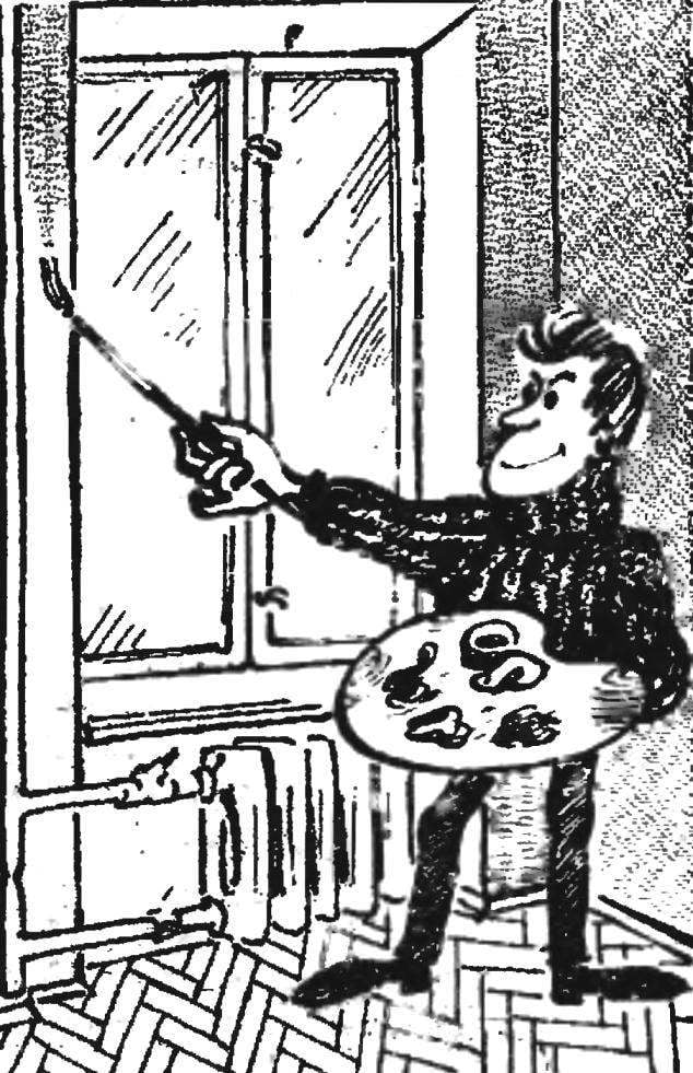
The color is easy to highlight a particular wall area of the room to emphasize the view from the window or to hide, to hide unwanted items — heating pipes, beams, risers, walls with a rough surface.
3. Illumination. Colors of rooms is, perhaps, depend on the nature of its illumination. Of the room, facing North and East, always colder colors, unfriendly. Therefore, they should choose the warm colors, and to the South, on the contrary, cold.
4. The purpose of the room also implies certain requirements to the color: for example, a hallway or lobby in need of warm, soft colors, but consistent with the tone of the walls in the other rooms. Colors in the living room should promote relaxation and rest, more calm in the bedroom; and a cooling effect tiles and porcelain 1 in the kitchen and in the bathroom soften the paints in warm tones.
